NTR: THE COLON AS IDENTITY
A corporate identity for public broadcaster NTR. The colon as a playful element.
The NTR is a result of the fusion of three public broadcasters. In collaboration with Studio Turner we developed a new visual identity. The colon used in the logo plays an important part in all aspects of the NTR. In each ident - a short clip shown after each NTR programme - two dots seem to take on a duel with the character before forming themselves into a colon, immediately followed by the slogan, ‘Especially for Everyone’. The above clip is a compilation of 6 different idents that are used alternately.
Red Dot Award for communication design


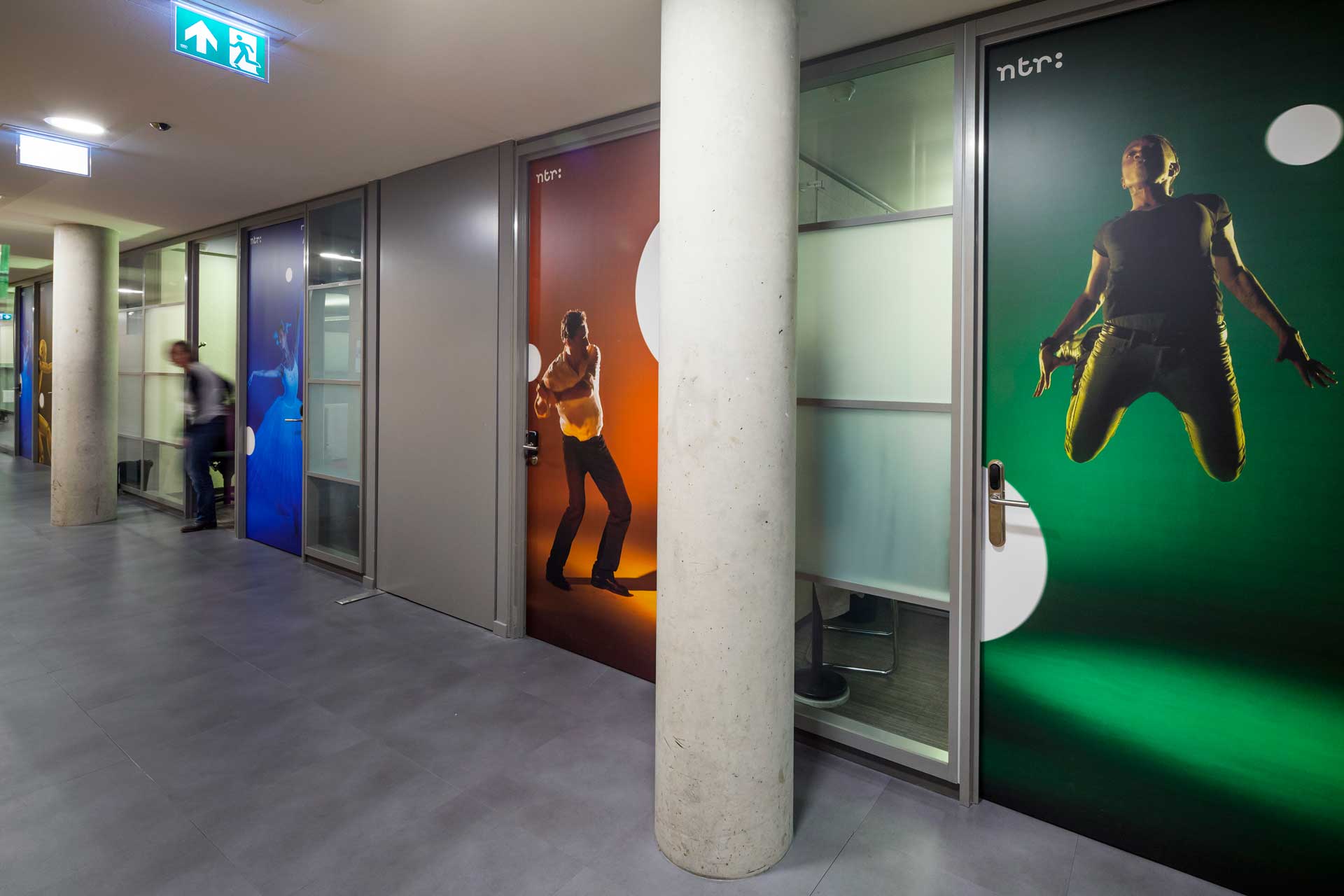
The doors and entrance to the edit suites are decorated with stills from the idents.
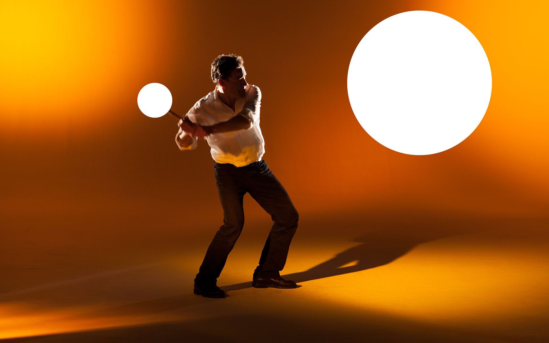
One of the 6 idents, with the crash test dummy, is a 3D animation executed by Happy Ship. This short clip shows the different phases of producing the animation.


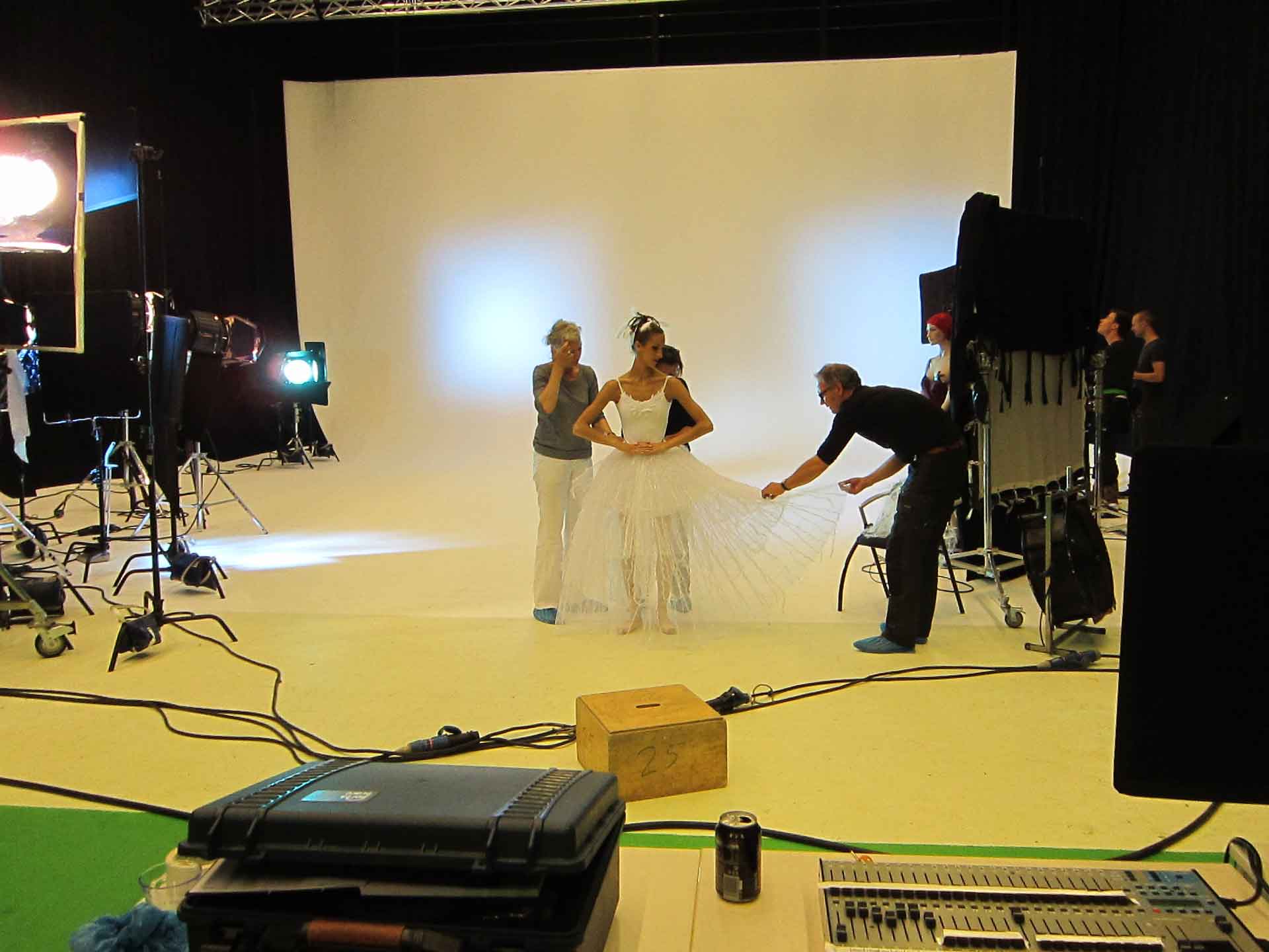


Making-of images of the production and shoot. The dress of the ballerina starts to grow during the clip. DOP Goof de Koning, make-up Trudy Buren en costumes by Sally Dyer.
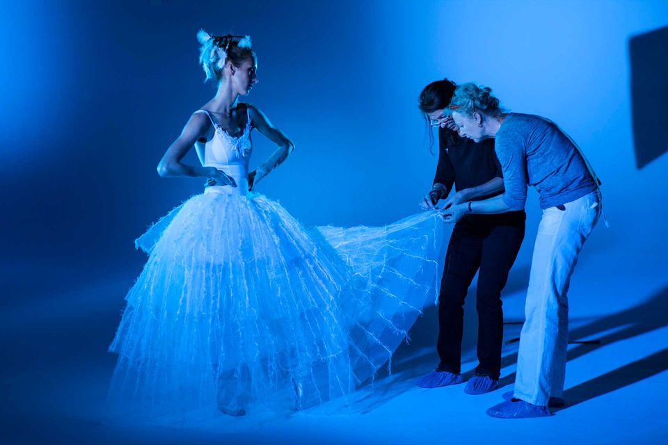
Yes, waiting on the set can be annoying..
NTR is an independent Dutch broadcaster. NTR expresses its identity through its logo: three letters followed by the two dots of the colon. These dots play the main role in campaigns, branding and corporate identity. The logo is usually accompanied by the slogan, 'especially, for everyone'.
NTR = INFORMATION
NTR = EDUCATION
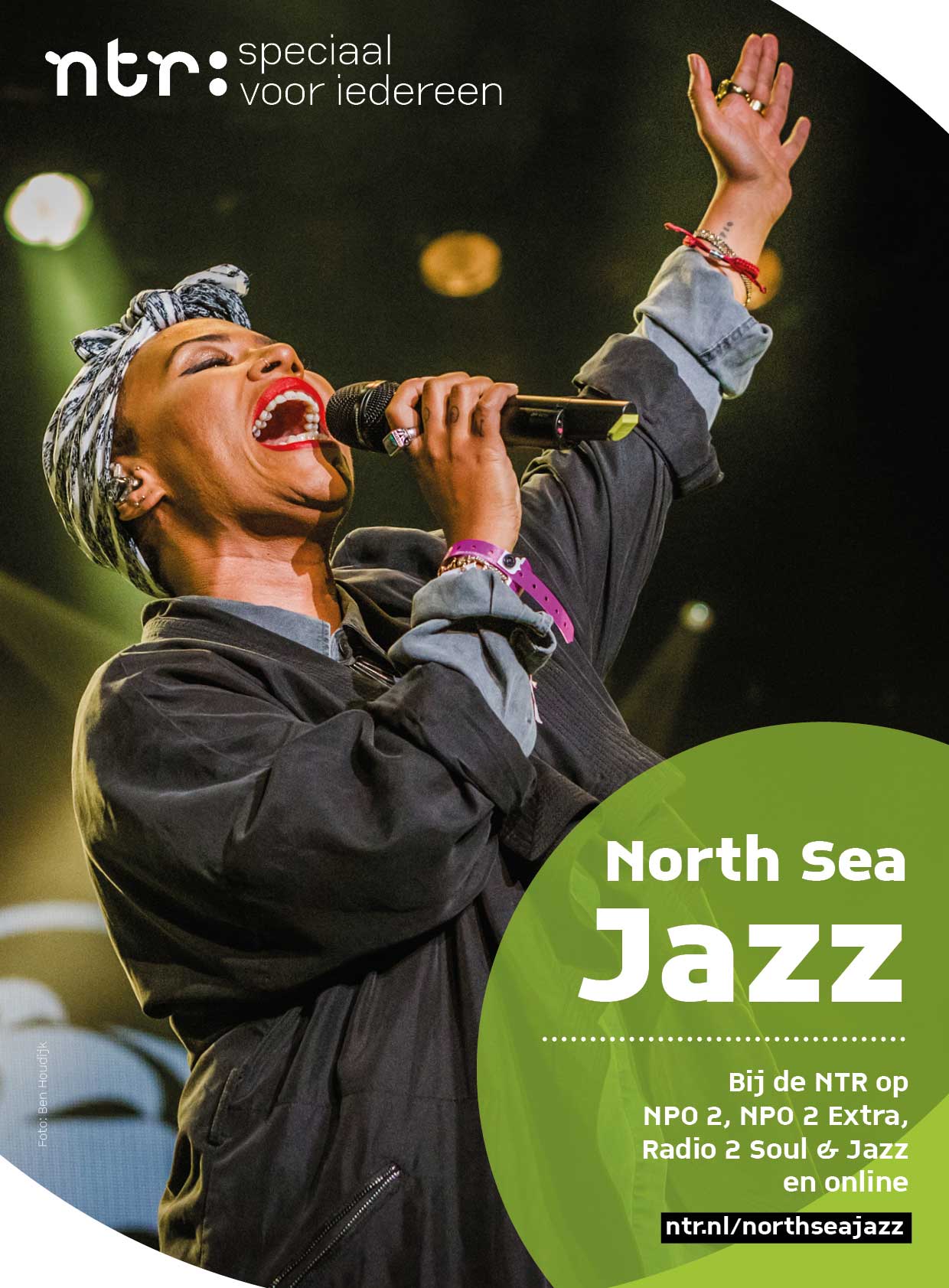
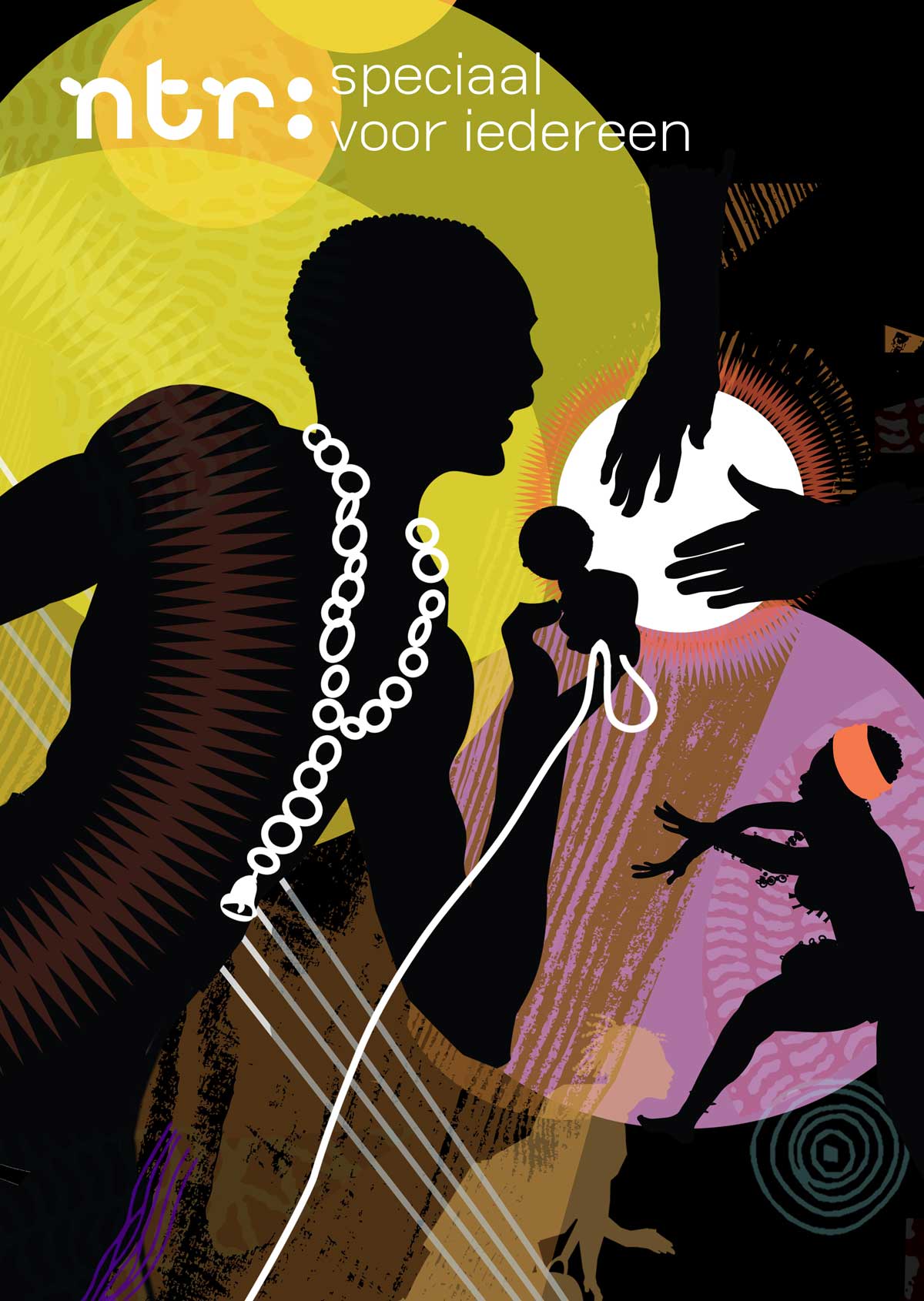
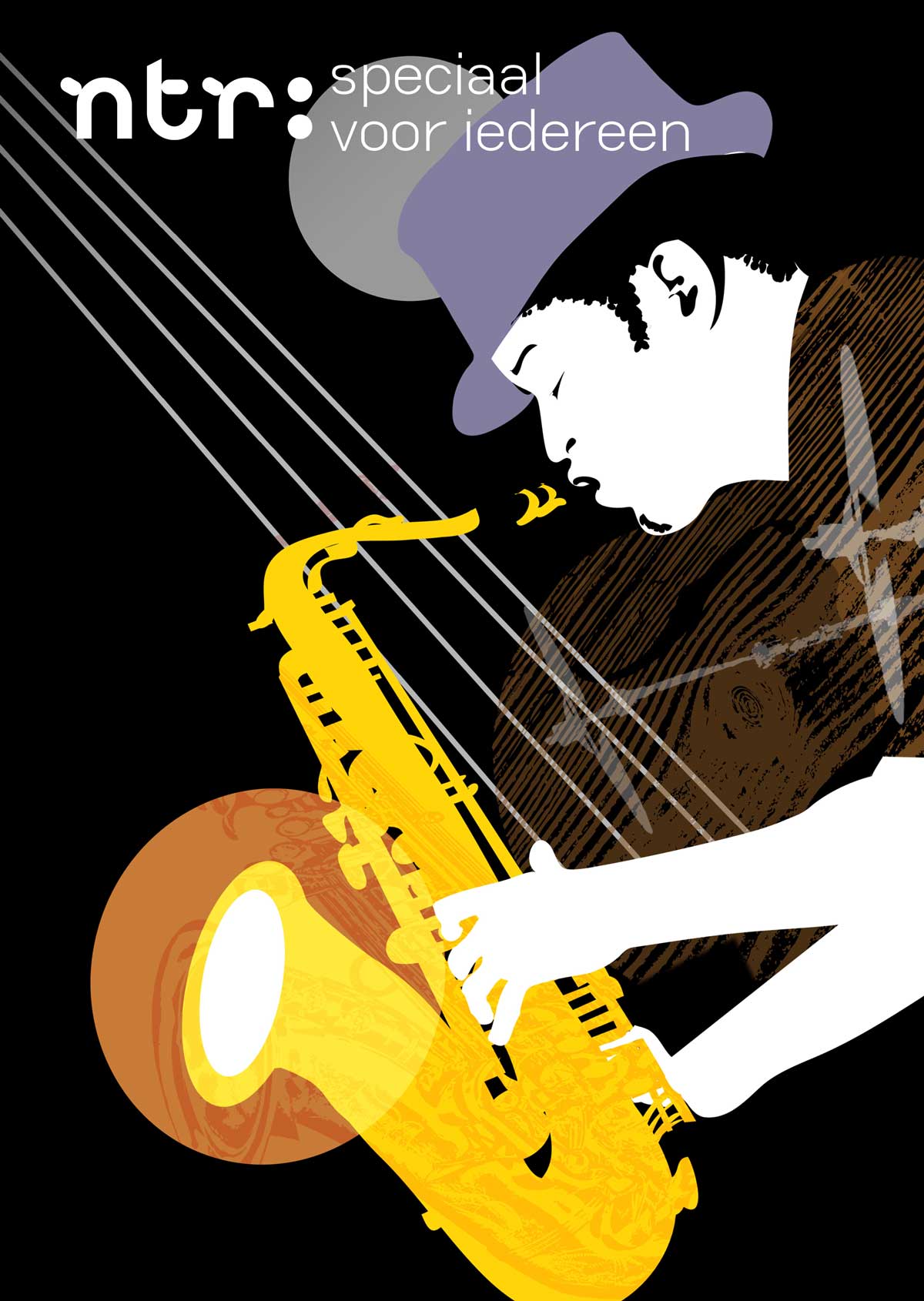
NTR = CULTURE
Culture, alongside education and information, is an NTR hallmark. The broadcaster also plays an essential part in the ‘Uitmarkt’, the opening of the Dutch cultural season.
The colon is often used as an animation in campaigns, as here for ‘NTR presents culture’.


Campaign ‘NTR presents culture’ on posters, pillars and social media.


Promo for opera performance.
Excerpt of the corporate film in which the people filmed design the subtitles with their own signature. Production by David Anker.
Even Father Christmas is confronted with the playful dots.
CREDITS - DESIGN & DIRECTION: RENÉ GAST - MOTION DESIGN: THIJS DIKSHOORN - ILLUSTRATION: YVONNE KROESE - SOUND DESIGN: KH MUSIC - Corporate identity NTR in cooperation with STUDIO TURNER
A NEW LOOK